Another release of Sonic Visualiser is out. This one, version 3.2, has some significant visible changes, in contrast to version 3.1 which was more behind-the-scenes.
The theme of this release could be said to be “oversampling” or “interpolation”.
Waveform interpolation
Ever since the Early Days, the waveform layer in Sonic Visualiser has had one major limitation: you can’t zoom in any closer (horizontally) than one pixel per sample. Here’s what that looks like — this is the closest zoom available in v3.1 or earlier:
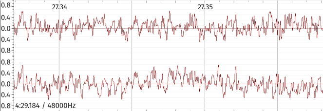
This isn’t such a big deal with a lower-resolution display, since you don’t usually want to interact with individual samples anyway (you can’t edit waveforms in Sonic Visualiser). It’s a bigger problem with hi-dpi and “retina” displays, on which individual pixels can’t always be made out.
Why this limitation? It allowed an integer ratio between samples and pixels to be used internally, which made it a bit easier to avoid rounding errors. It also sidestepped any awkward decisions about how, or whether, to show a signal in between the sample points.
(In a waveform editor like Audacity it is necessary to be able to interact with individual samples, so some decision has to be made about what to show between the sample points when zoomed in closely. Older versions of Audacity connected the sample points with straight lines, a decision which attracted criticism as misrepresenting how sampling works. More recent versions show sample points on separate stems without connecting lines.)
In Sonic Visualiser v3.2 it’s now possible to zoom closer than one pixel per sample, and we show the signal oversampled between the sample points using sinc interpolation. Here’s an example from the documentation, showing the case where the sample values are all zero but for a single sample with value 1:
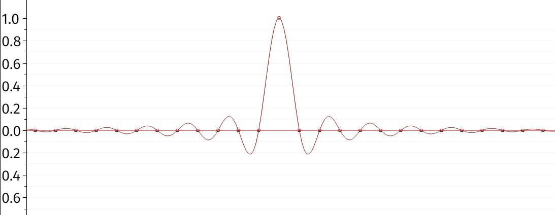
The sample points are the little square dots, and the wiggly line passing through them is the interpolated signal. (The horizontal line is just the x axis.) The principle here is that, although there are infinitely many ways to join the dots, there is only one that is “smooth” enough to be expressible as a sum of sinusoids of no higher frequency than half the sampling rate — which is the prerequisite for reconstructing a signal sampled without aliasing. That’s what is shown here.
The above artificial example has a nice shape, but in most cases with real music the interpolated signal will not be very different from just joining the dots with a marker. It’s mostly relevant in extreme cases. Let’s replace the single sample of value 1 above with a pair of consecutive samples of value 0.5:

Now we see that the interpolated signal has a peak between the two samples with a greater level than either sample. The peak sample value is not a safe indication of the peak level of the analogue signal.
Incidentally, another new feature in v3.2 is the ability to import audio data from a CSV or similar data file rather than only from standard audio formats. That made it much easier to set up the examples above.
Spectrogram and spectrum oversampling
The other oversampling-related feature added in v3.2 appears in the spectrogram and spectrum layers. These layers now have an option to set an oversampling level, from the default “1x” up to “8x”.
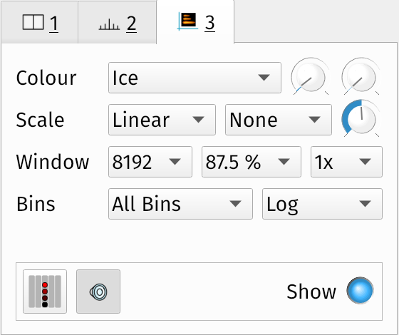
This option increases the length of the short-time Fourier transform used to generate the spectrum, by padding the time-domain signal window with additional zero-valued samples before calculating the transform. This results in an oversampled frequency-domain output, with a higher visual resolution than would have been obtained from the original, un-zero-padded sample window. The result is a smoother spectrum in which the locations of peaks can be seen with a little more accuracy, somewhat like the waveform example above.
This is nice in principle, but it can be deceiving.
In the case of waveform oversampling, there can be only one “matching” signal, given the sample points we have and the constraints of the sampling theorem. So we can oversample as much as we like, and all that happens is that we approximate the analogue signal more closely.
But in a short-time spectrum or spectrogram, we only use a small window of the original signal for each spectrum or spectrogram-column calculation. There is a tradeoff in the choice of window size (a longer window gives better frequency discrimination at the expense of time discrimination) but the window always exposes only a small part of the original signal, unless that signal is extremely short. Zero-padding and using a longer transform oversamples the output to make it smoother, but it obviously uses no extra information to do it — it still has no access to samples that were not in the original window. A higher-resolution output without any more information at the input can appear more effective at discriminating between frequencies than it really is.
Here’s an example. The signal consists of a mixture of two sine waves one tone apart (440 and 493.9 Hz). A log-log spectrum (i.e. log frequency on x axis, log magnitude on y) with an 8192-point short-time Fourier transform looks like this:

A log-log spectrum with a 1024-point STFT looks like this1:

The 1024-sample input isn’t long enough to discriminate between the two frequencies — they’re close enough that it’s necessary to “hear” a longer fragment than this in order to determine that there are two frequencies at all2.
Add 8x oversampling to that last example, and it looks like this:

This is very smooth and looks super detailed, and indeed we can use it to read the peak value with more accuracy — but the peak is deceptive, because it is still merging the two frequency components. In fact most of the detail here consists of the frequency response of the 1024-point windowing function used to shape the time-domain window (it’s a Hann window in this case).
Also, in the case of peak frequencies, Sonic Visualiser might already provide a way to get the same information more accurately — its peak-frequency identification in both spectrum and spectrogram views uses phase unwrapping instead of spectrum interpolation to estimate the frequencies of stable harmonics, which gives very good results if the sound is indeed harmonic and stable.
Finally, there’s a limitation in Sonic Visualiser’s implementation of this oversampling feature that eliminates one potential use for it, which is to choose the length of the Fourier transform in order to align bin frequencies with known or expected frequency components of the signal. We can’t generally do that here, since Sonic Visualiser still only supports a few fixed multiples of a power-of-two window size.
In conclusion: interesting if you know what you’re looking at, but use with caution.
1 Notice that we are connecting sample points in the spectrum with straight lines here — the same thing I characterised as a bad idea in the discussion of waveforms above. I think this is more forgivable here because the short-time transform output is not a sampled version of an original signal spectrum, but it’s still a bit icky
2 This is not exactly true, but it works for this example
